









KFC_REBRAND
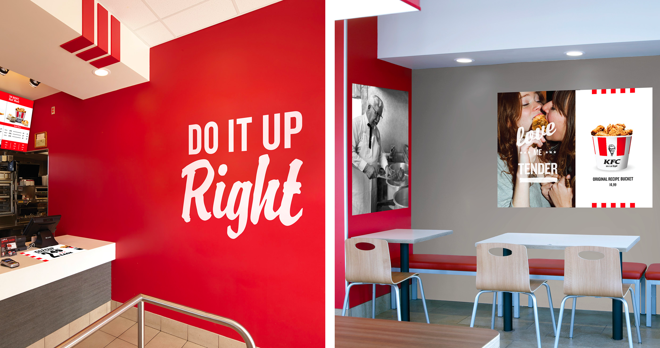
-One of my first projects in advertising was to help update KFC’s brand image and design language.
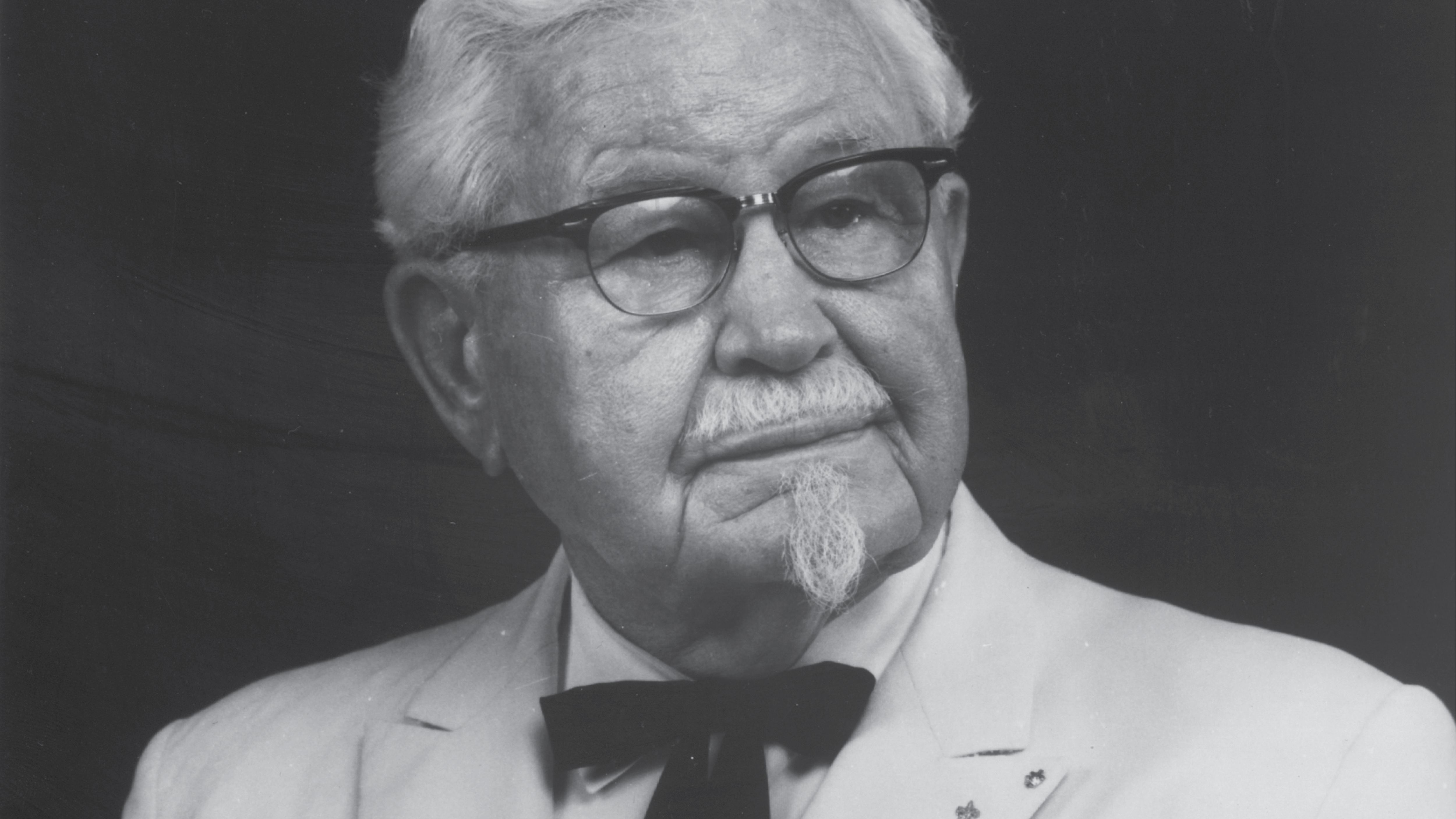
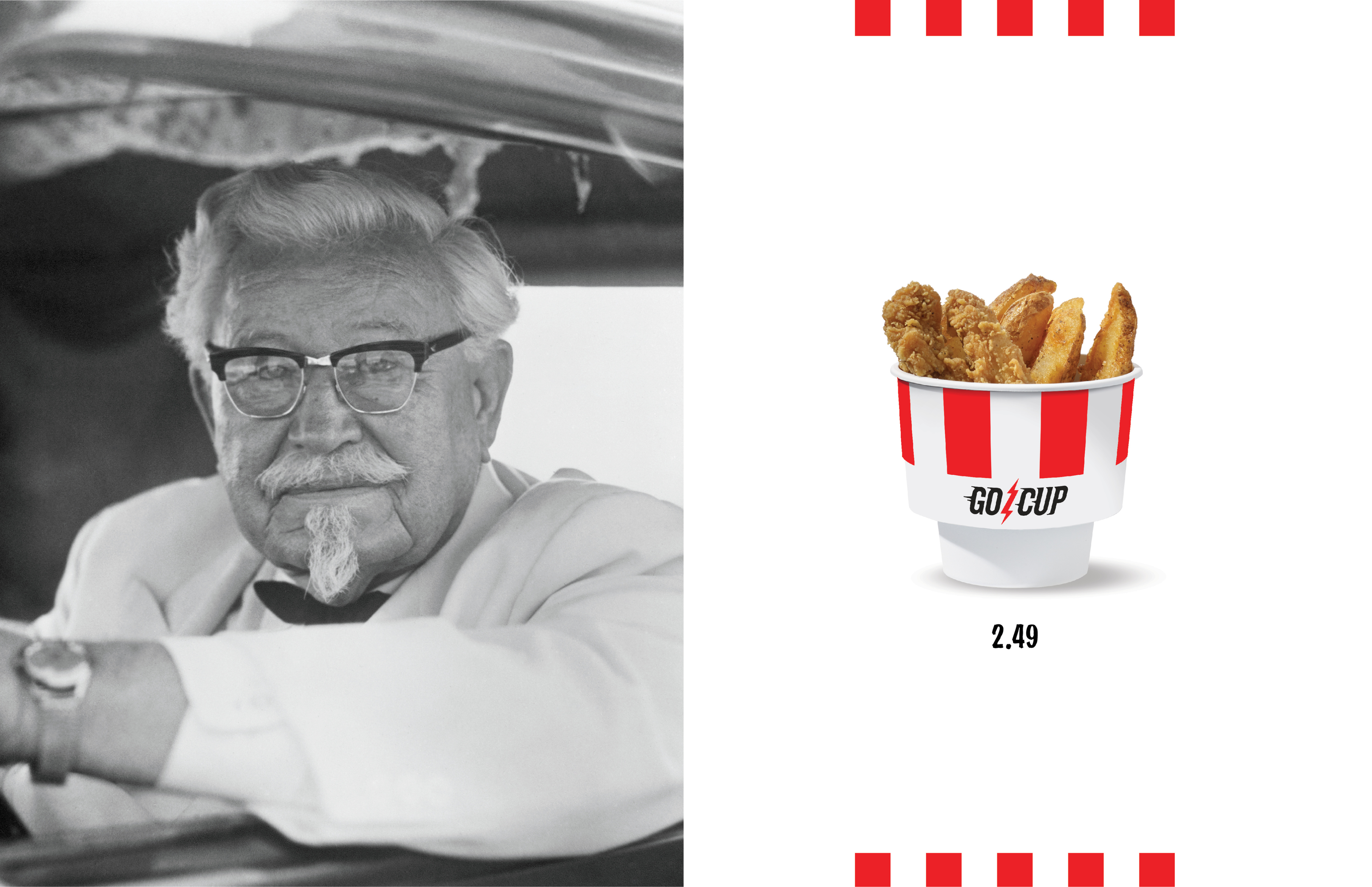
For much of the 2000’s they had leaned away from all the things that made the brand special. In fact, for many years they had benched the Colonel himself.
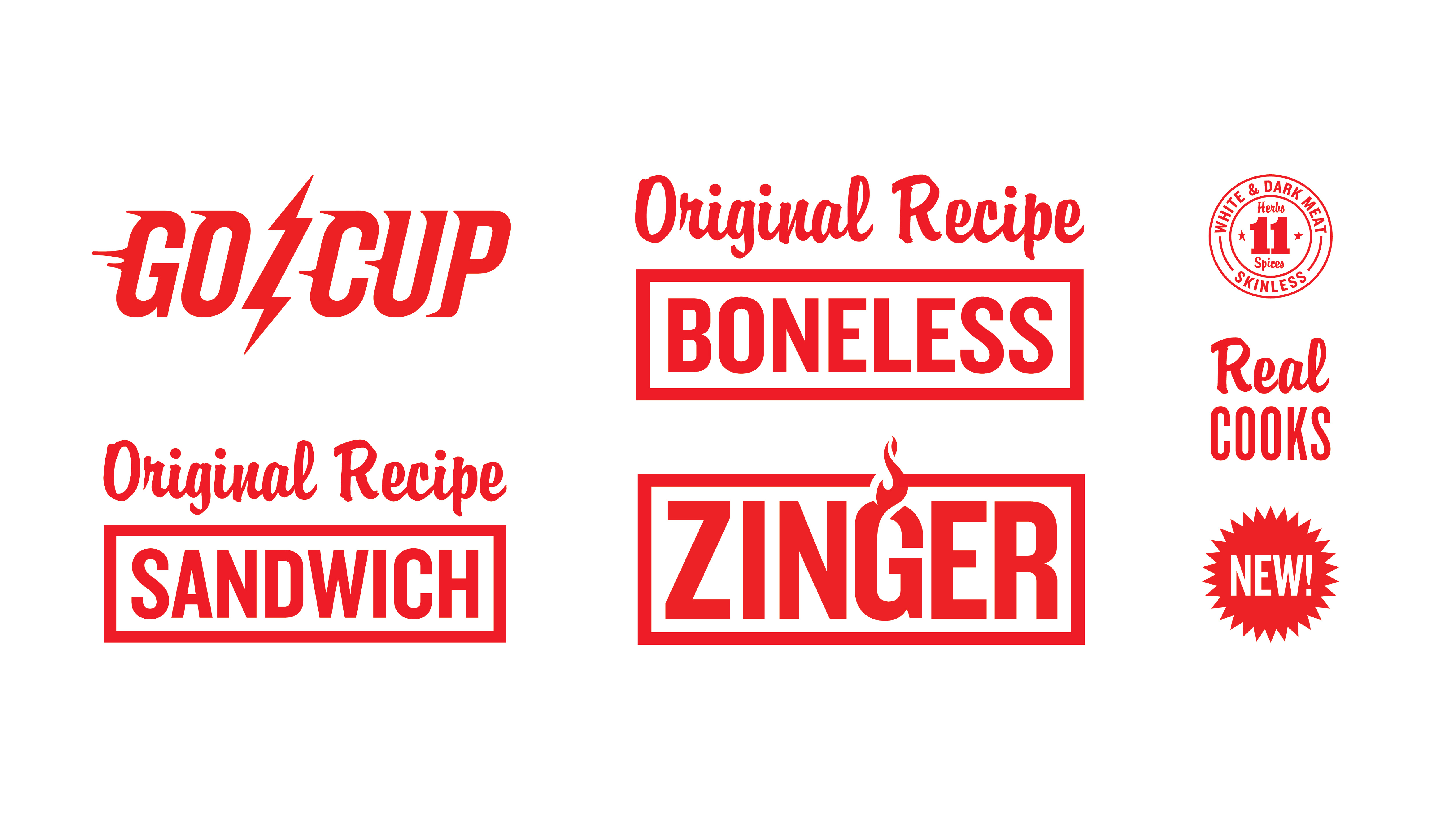
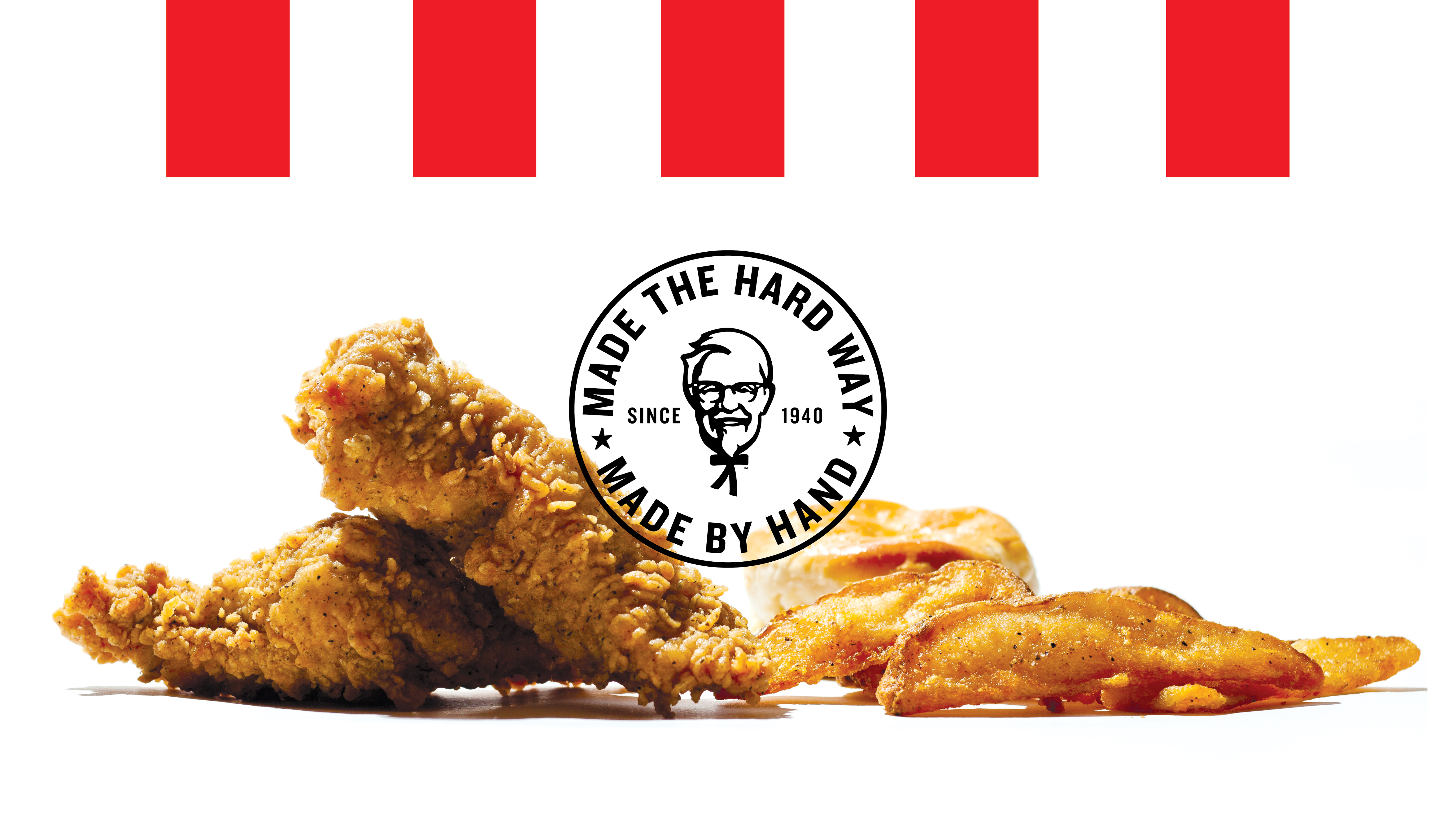
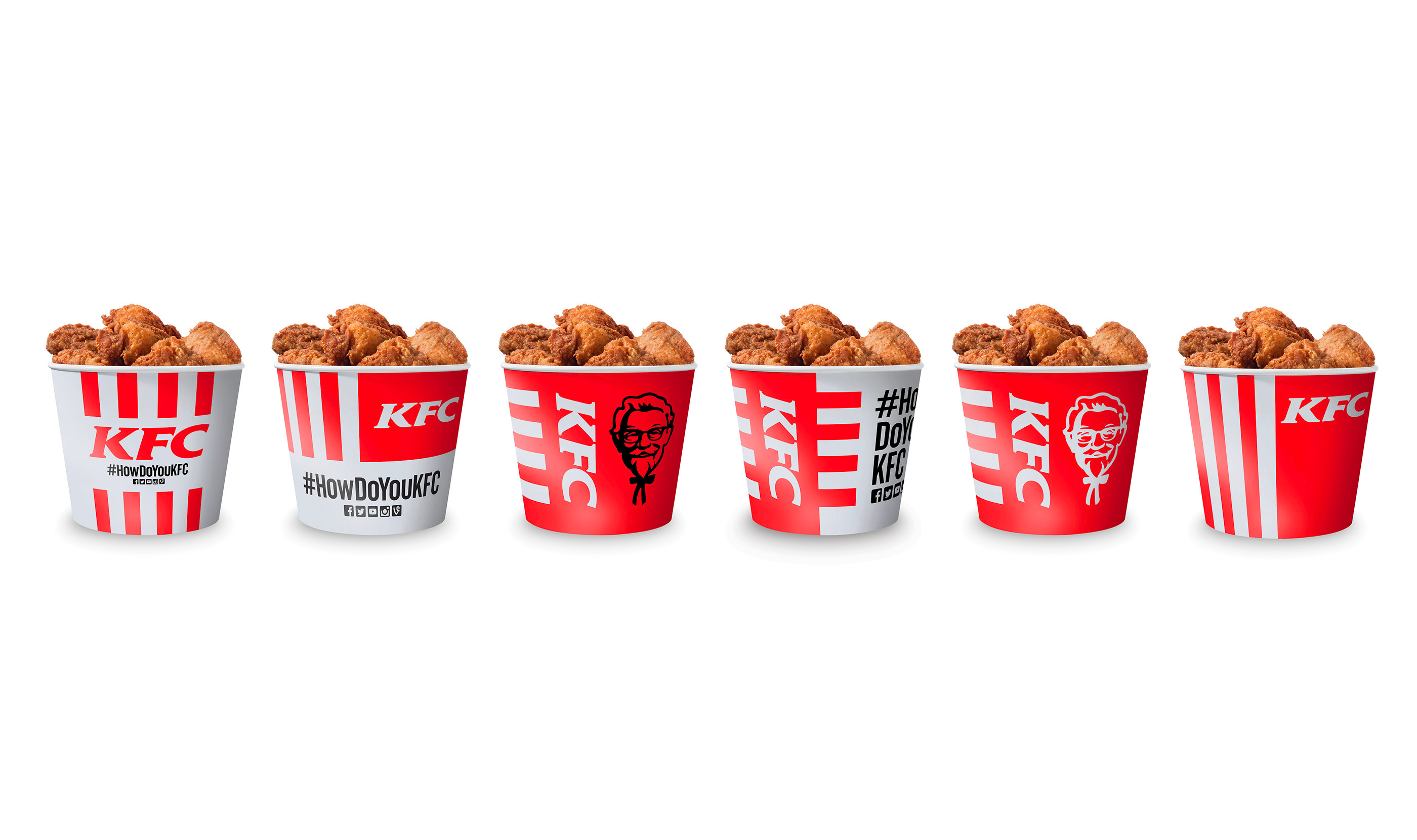
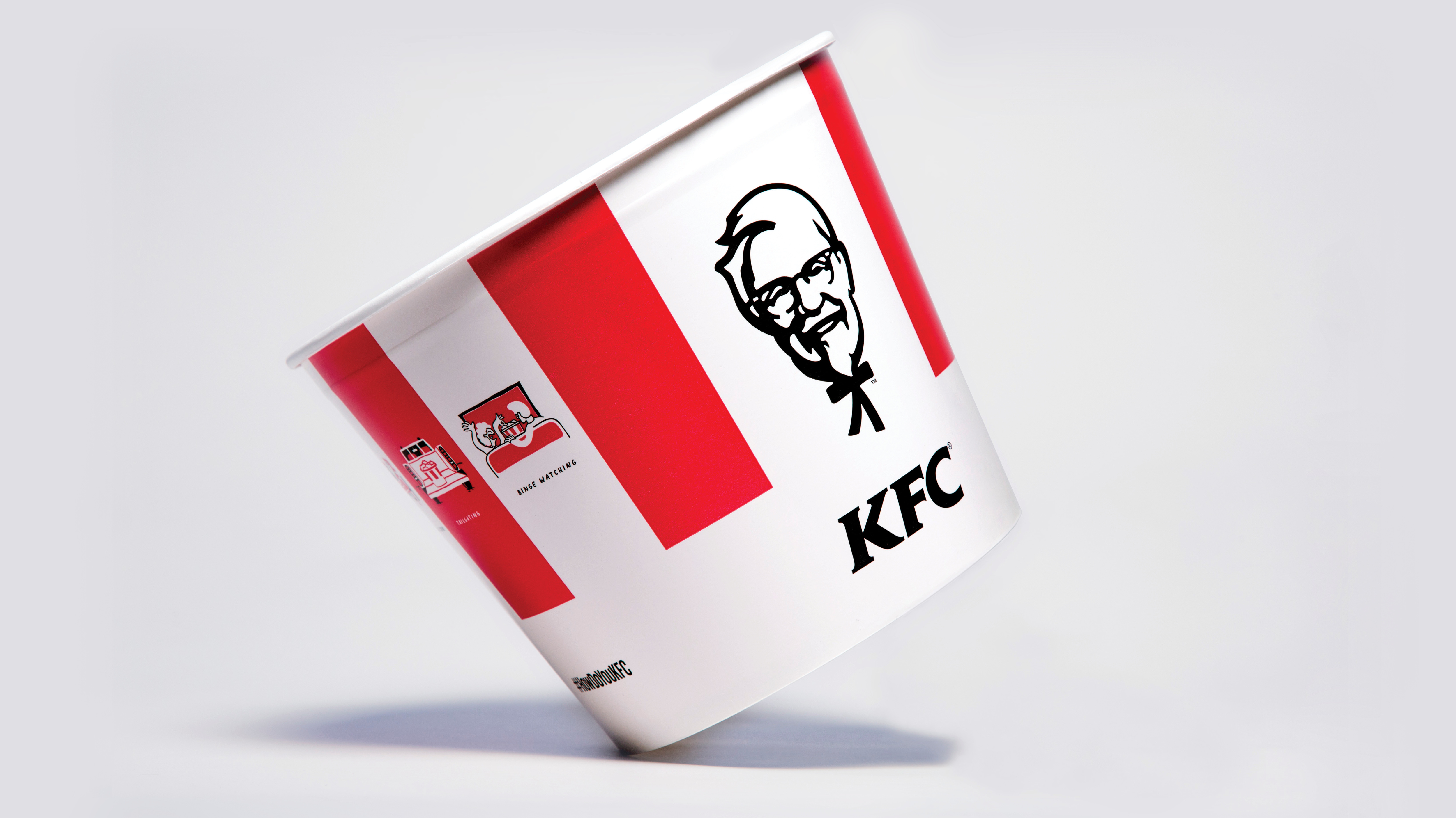
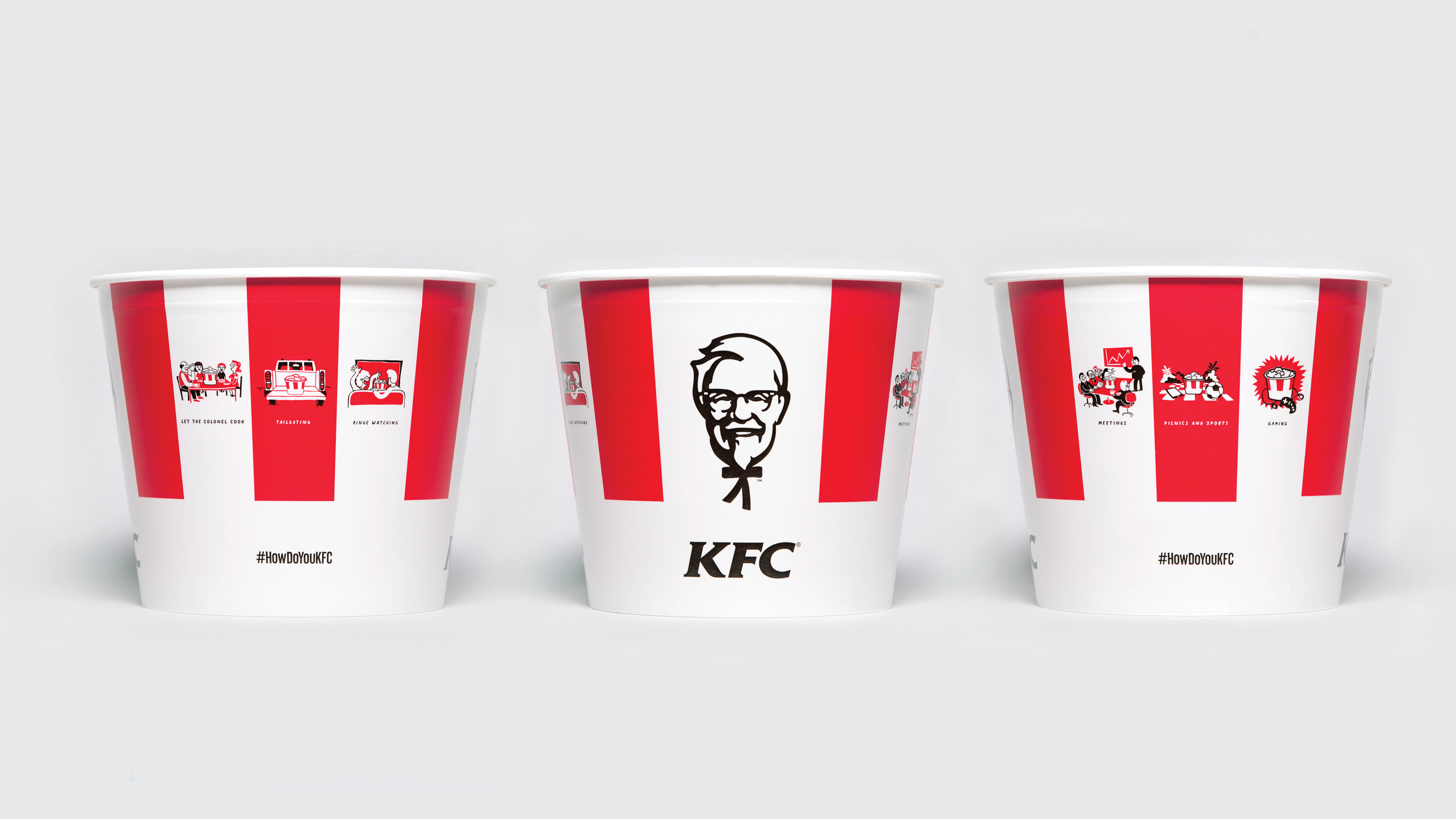
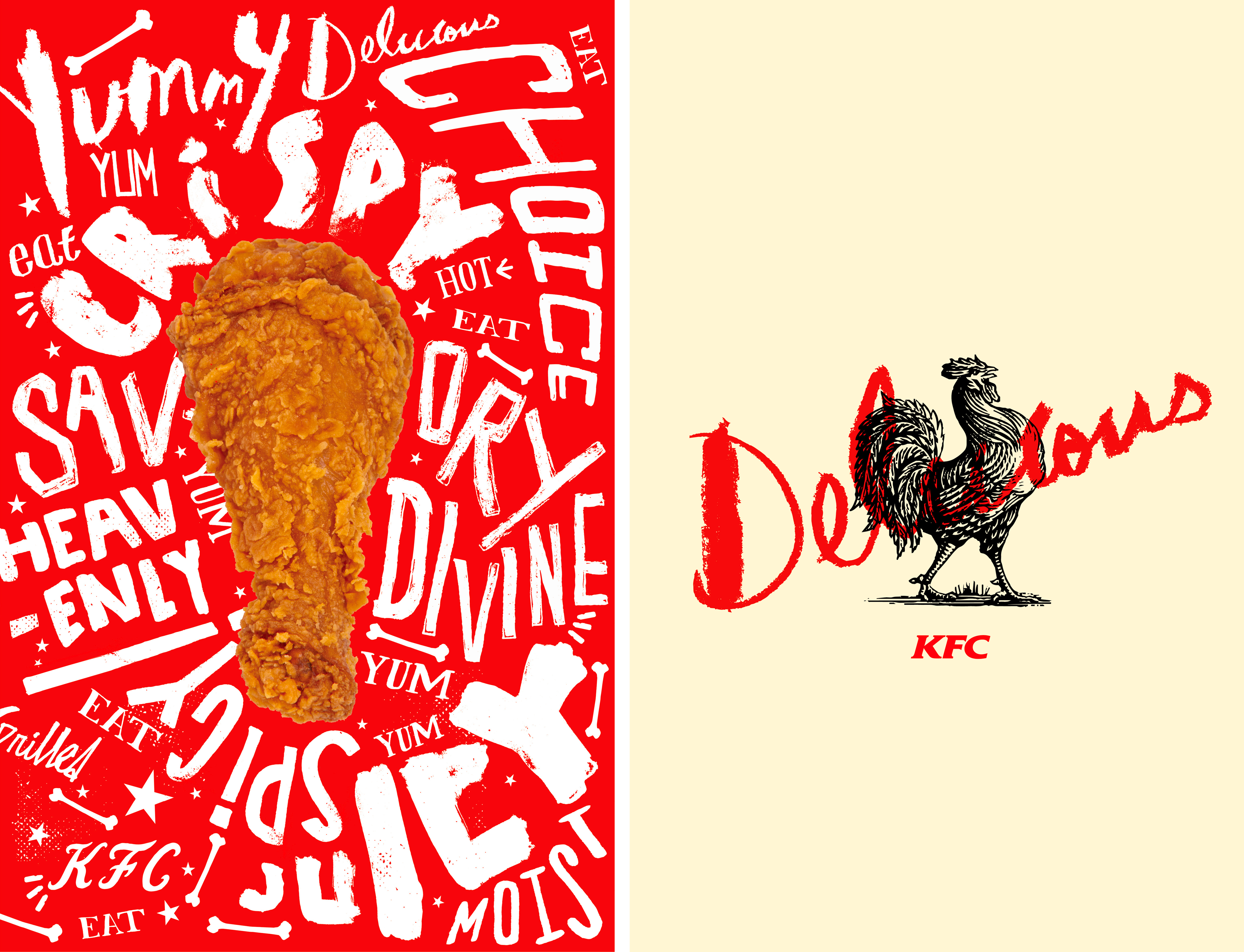
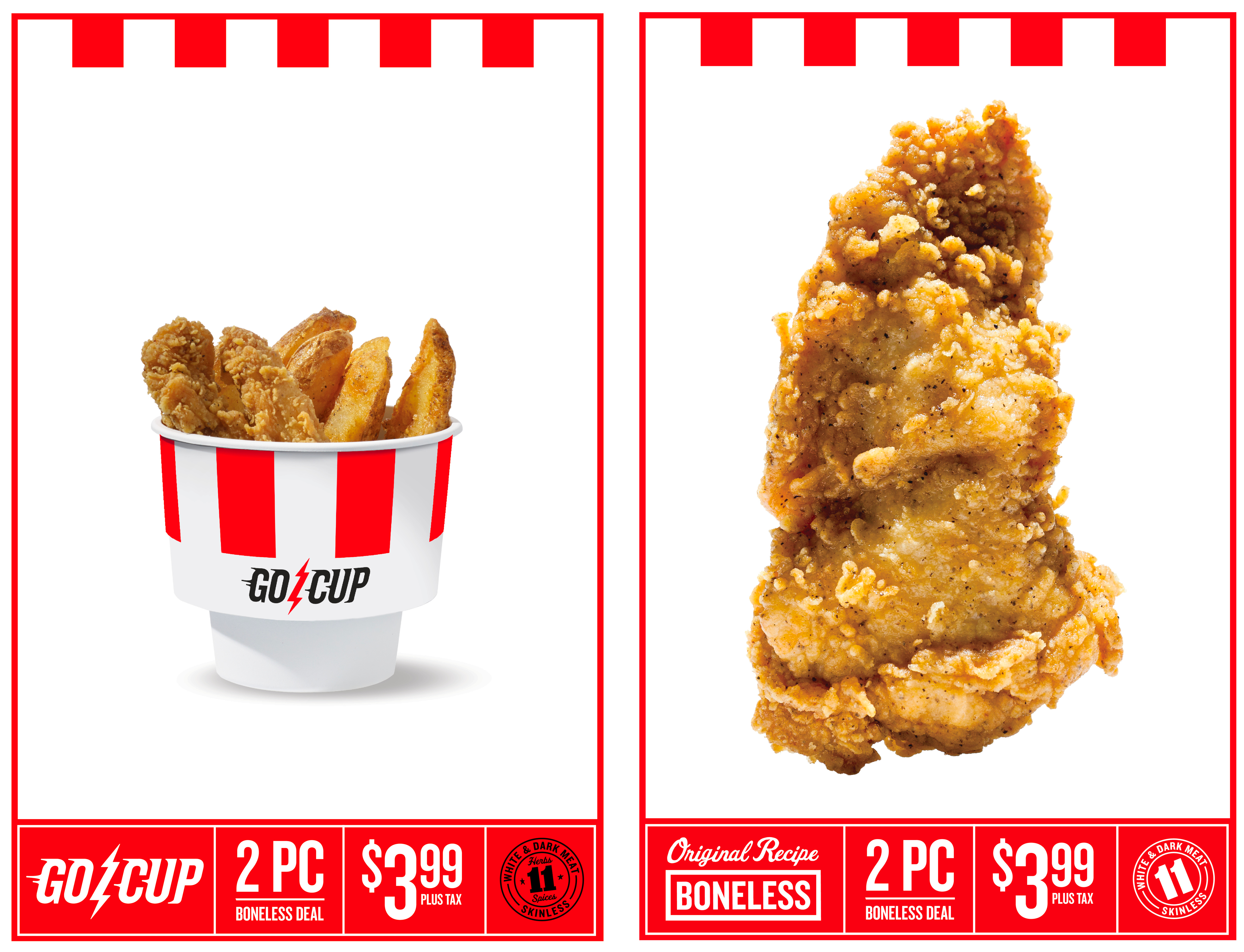
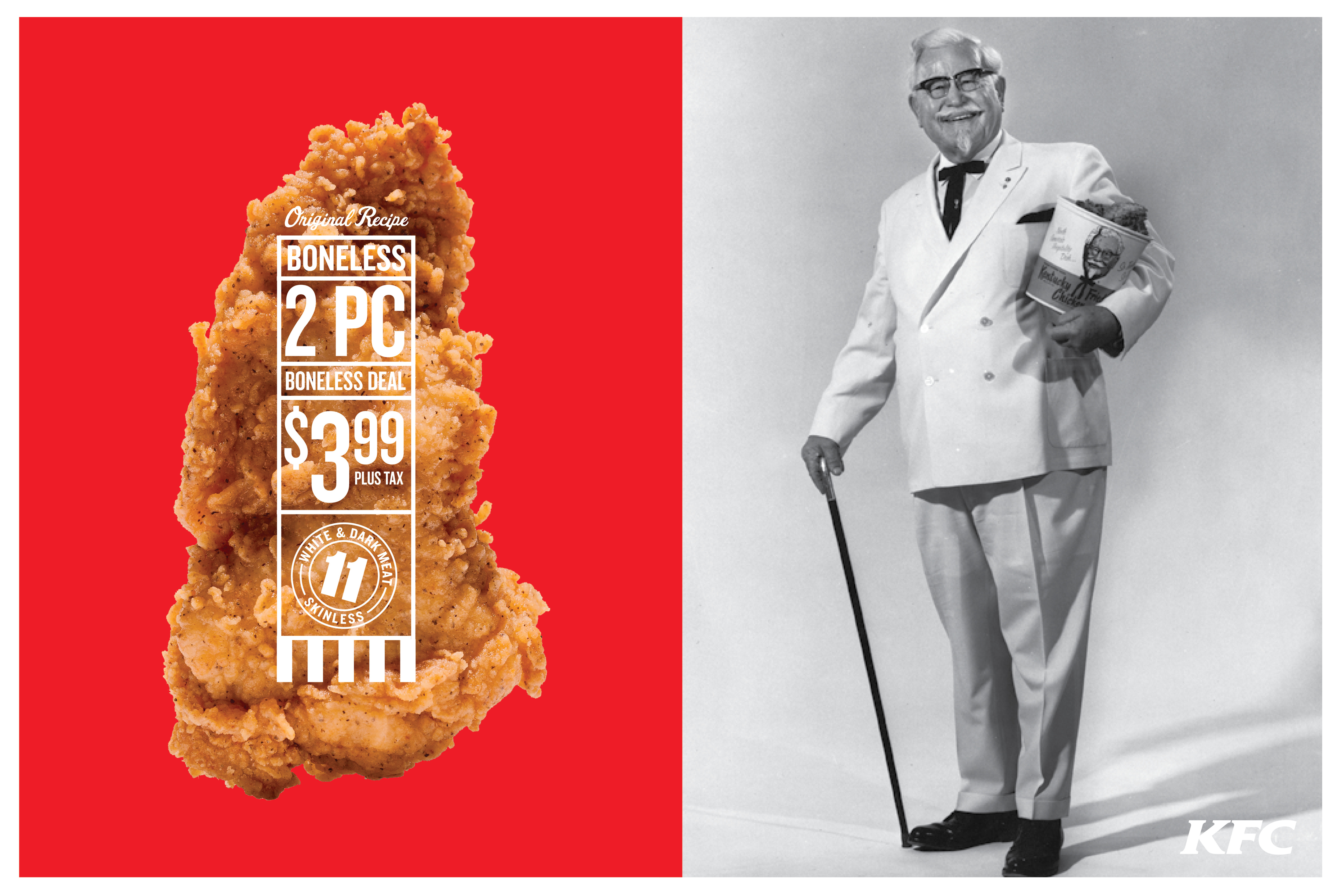
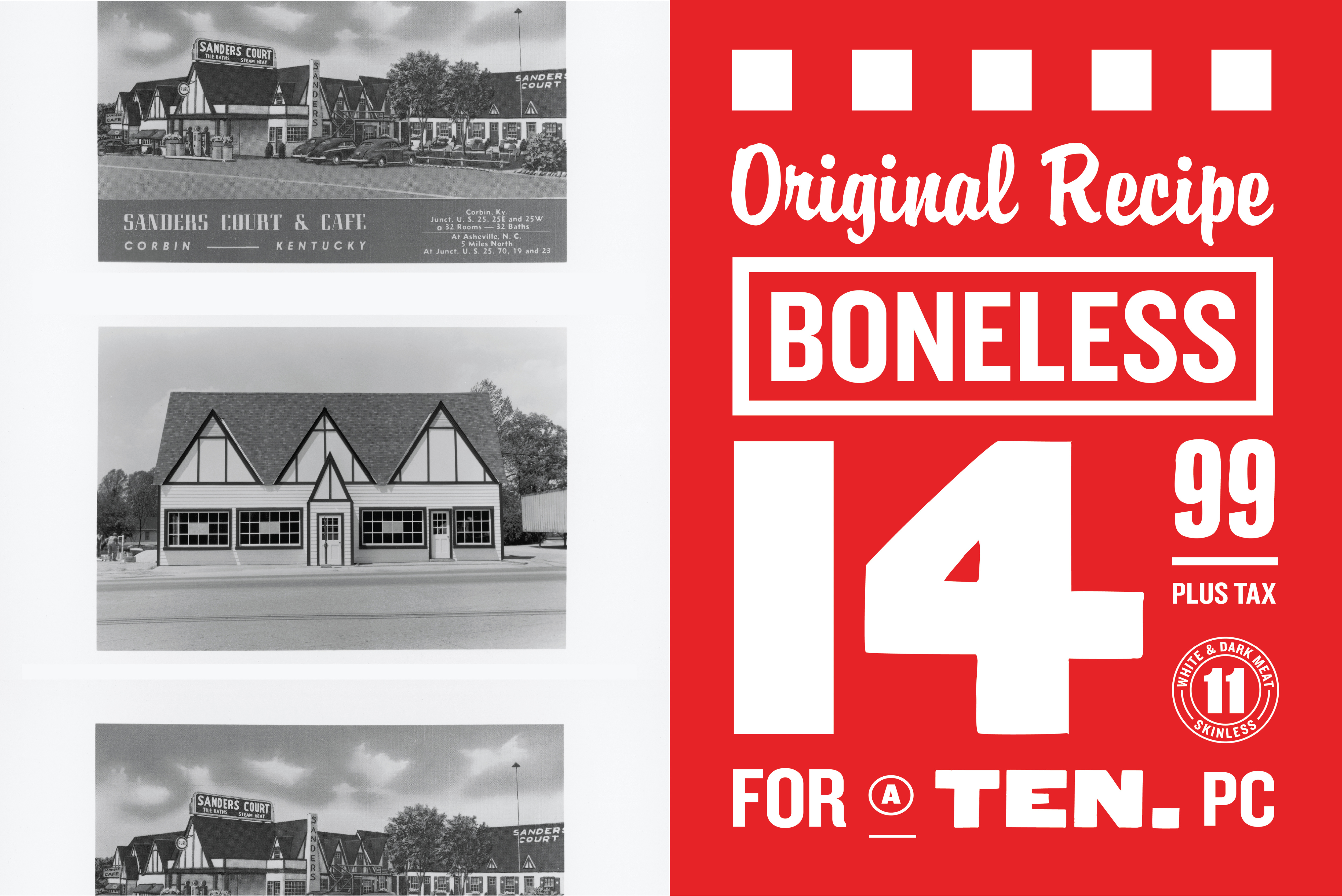
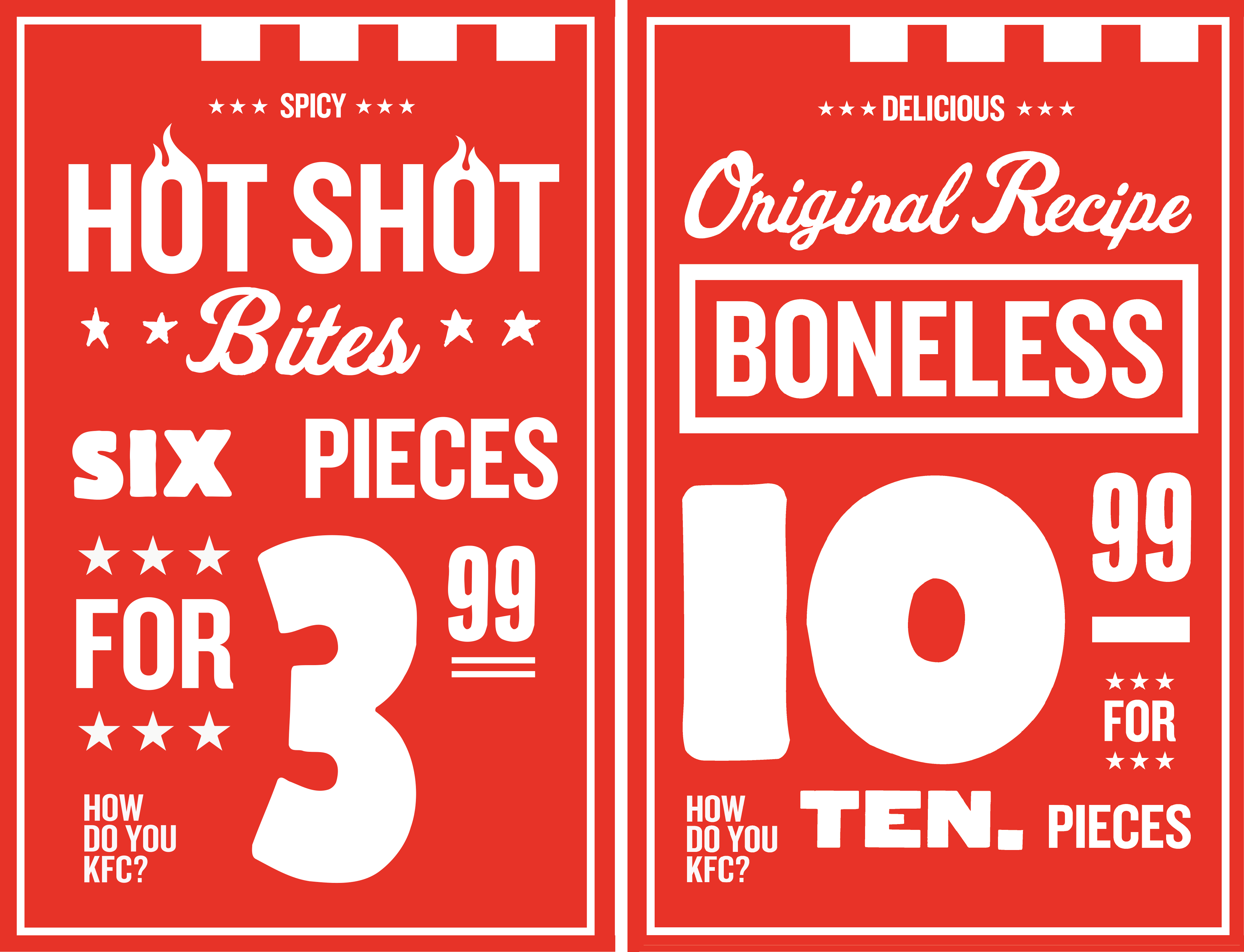
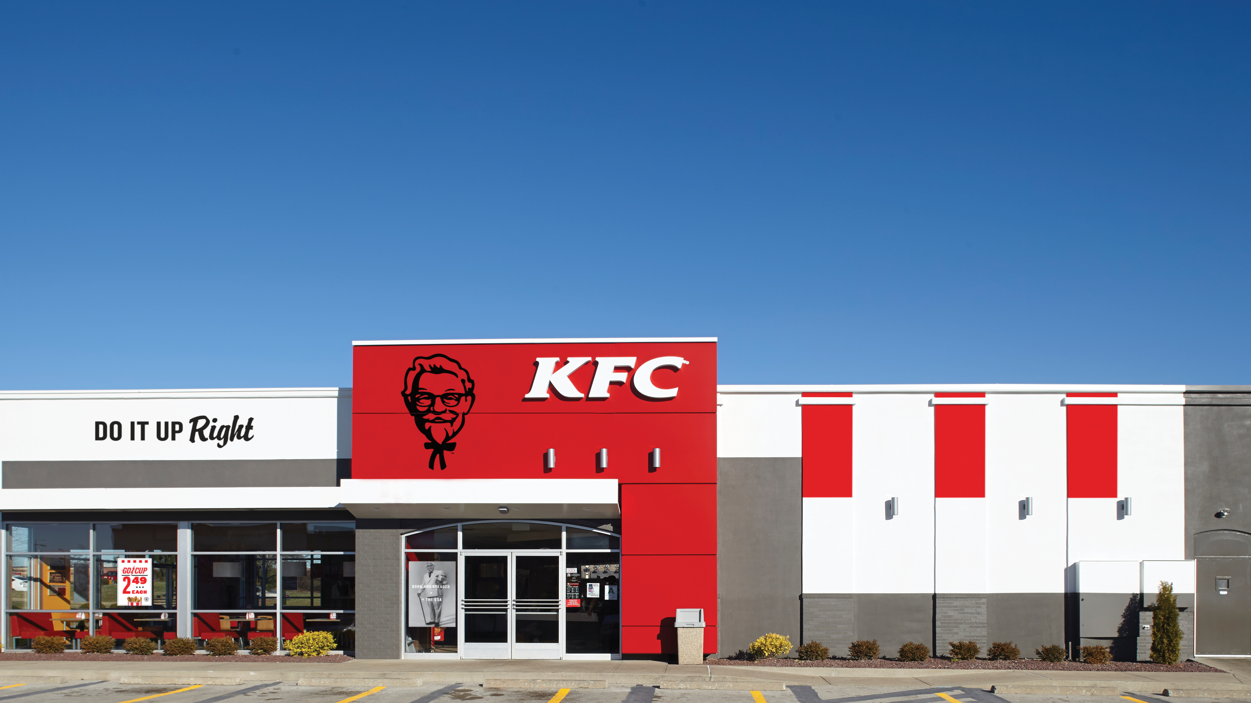
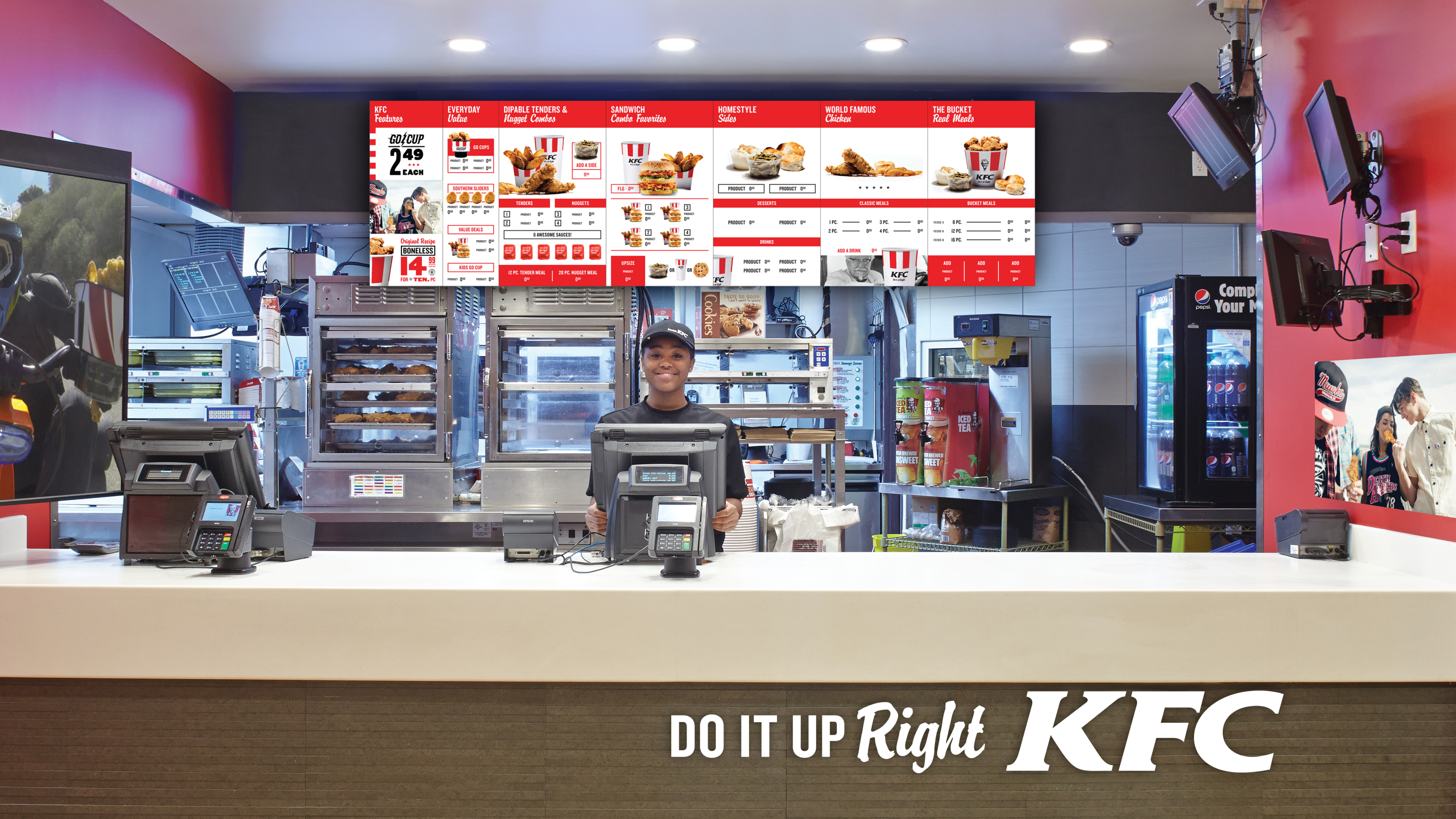
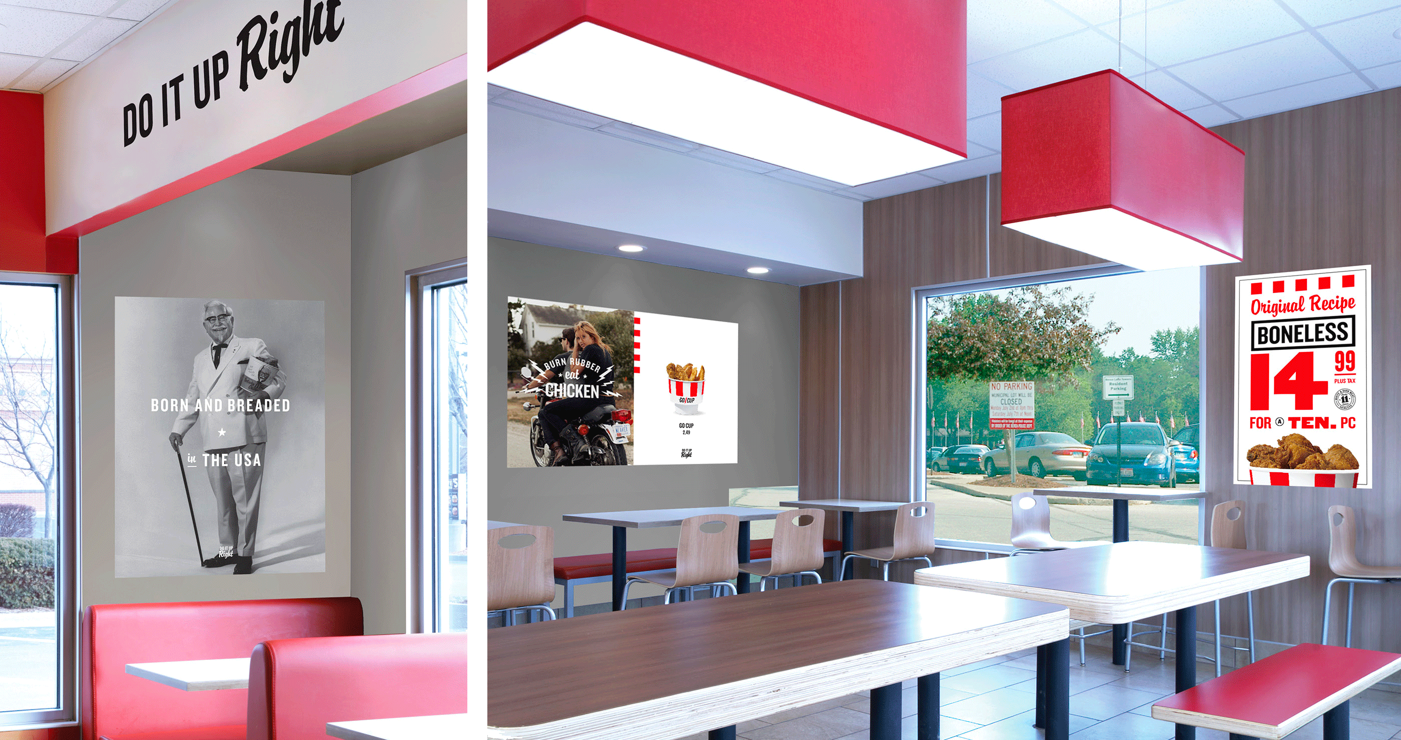
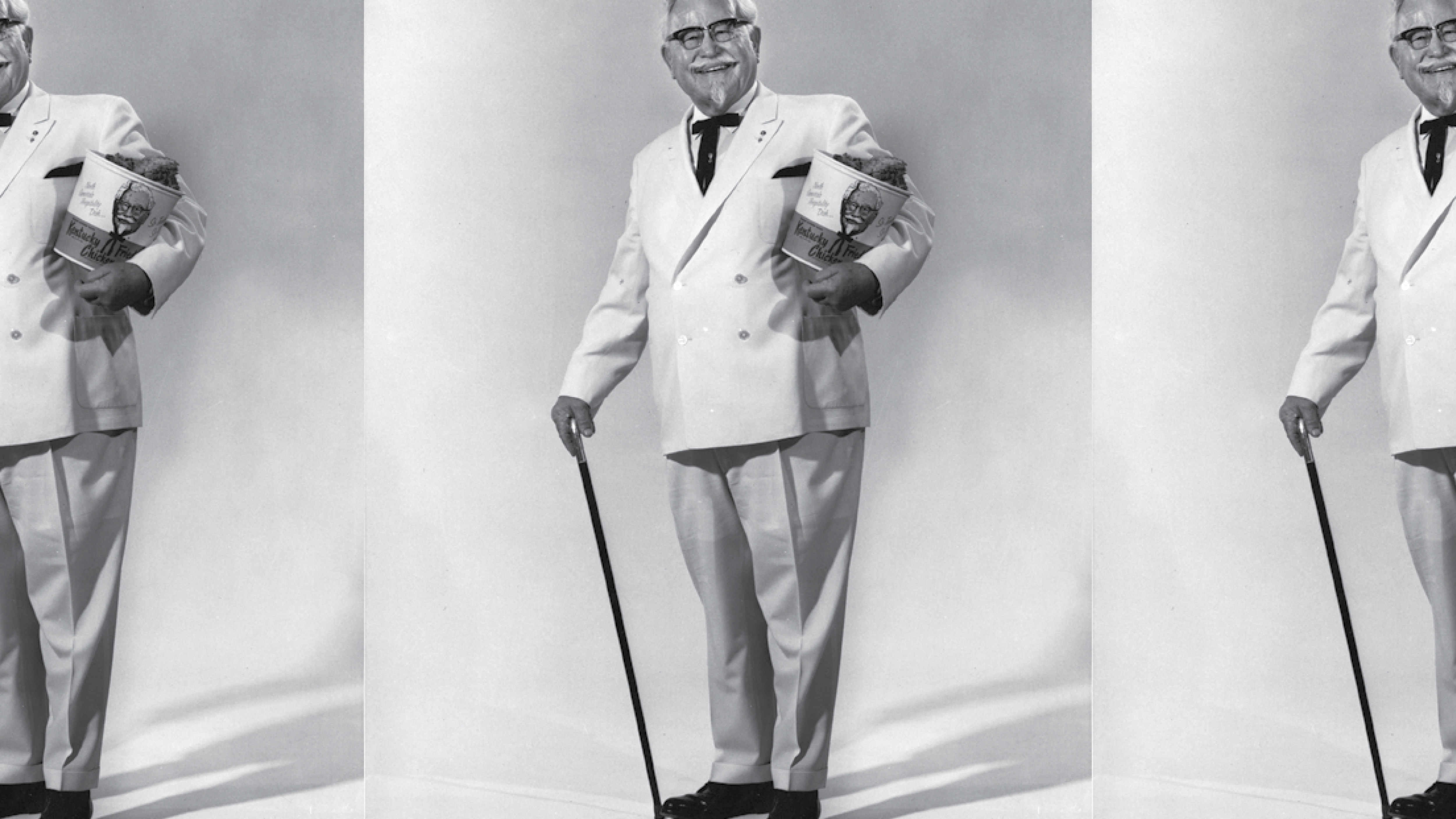
For our refresh we opted to take the brand back to its roots, albeit with a modern twist. We coupled nostalgic brands images with modern fonts and a stripped back color pallete to create something that felt retro and new all at the same time. Most importantly we wanted to put the Colonel, and everything he believed, front and center for the brand.
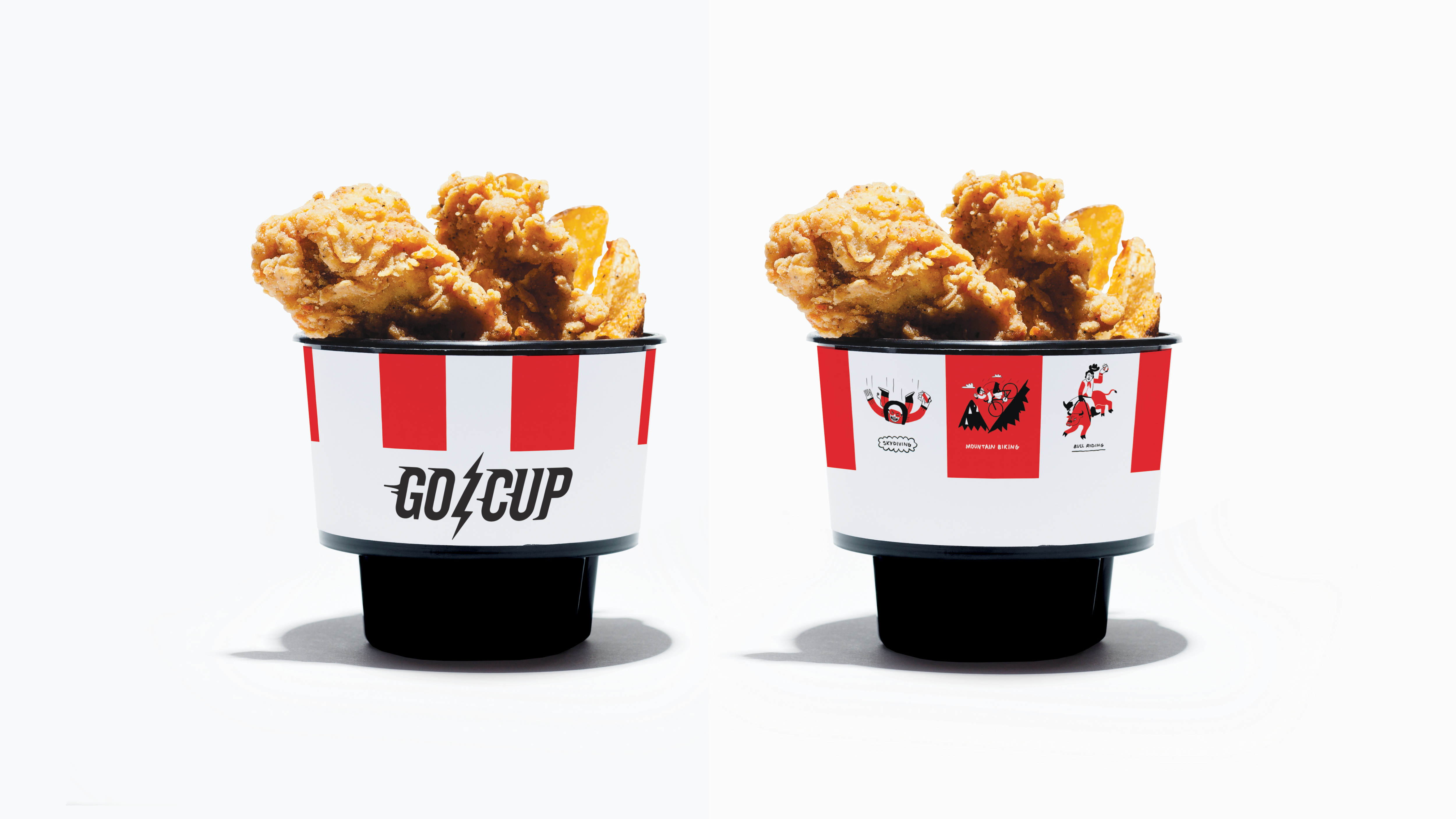
This work is a sampling of the system we proposed. Many of these elements being the basis for KFC’s modern brand identity.
-
TEAM
-
Produced @ FCB Chicago
-
Creative Direction / GrandArmy
Design / Ang Gispert, Johnross Post
Produced @ FCB Chicago
-
Creative Direction / GrandArmy
Design / Ang Gispert, Johnross Post